Logo History
History of the �鶹��Ƶ������� Logo
The �鶹��Ƶ������� logo has changed a lot over the years. Here’s a look back on the various logos throughout the decades.
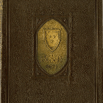
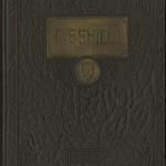
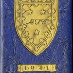
1920��–1940��
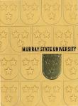
Different versions of the traditional, flat-top logo with variations on the shield’s curve and adornments were used during these decades. However, the most traditional University logo was most prevalent, and this is the logo that the University has gone back to time and time again.
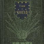
1950s
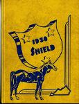
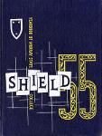
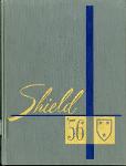
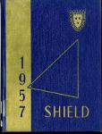
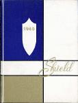
A pointed-top logo was used in the 1951 edition of the Shield, but all of the subsequent yearbooks during this decade showed variations of a flat-top shield.
1960��–1970��
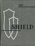
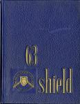
Elongated versions of a pointed-top shield, as well as the traditional University logo, were used during this time. However, a variation of the traditional logo that included a rounded bottom and occasionally a ribbon was predominant throughout these decades.
1980��–1990��
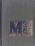
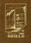
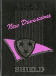
Signage plans from 1976 showed a rounder, simpler version of the shield design, but no usage of this logo was found until the 1980s. It appeared in the Shield yearbooks into the 1990s, and literature said its use was for “informal activities,” whereas the traditional logo was the “official” logo.
Anniversary Years
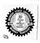
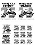
In both 1972 (the University’s 50th anniversary) and 1997 (the 75th anniversary), Murray State went back to tradition and highlighted iterations of the original, flat-top logo.
2000s
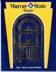
The logo touting Murray State as “Kentucky’s Public Ivy University” was found on publications and websites during this time. Also, like prior years, the University returned to the traditional, flat-top logo throughout the 2000s. The logo with the star-shaped cutout was introduced in 2009.
2016
The new Murray State logo celebrates the University’s rich history through a modernized design. The new shield echoes the traditional version by mimicking the curves and using a flat top, while presenting an updated color palate and simplified adornments.

Materials courtesy of Pogue Special Collections Library.

